Logo Design
Words That Move Me Podcast - Logo design made for a client through my personal design practice.
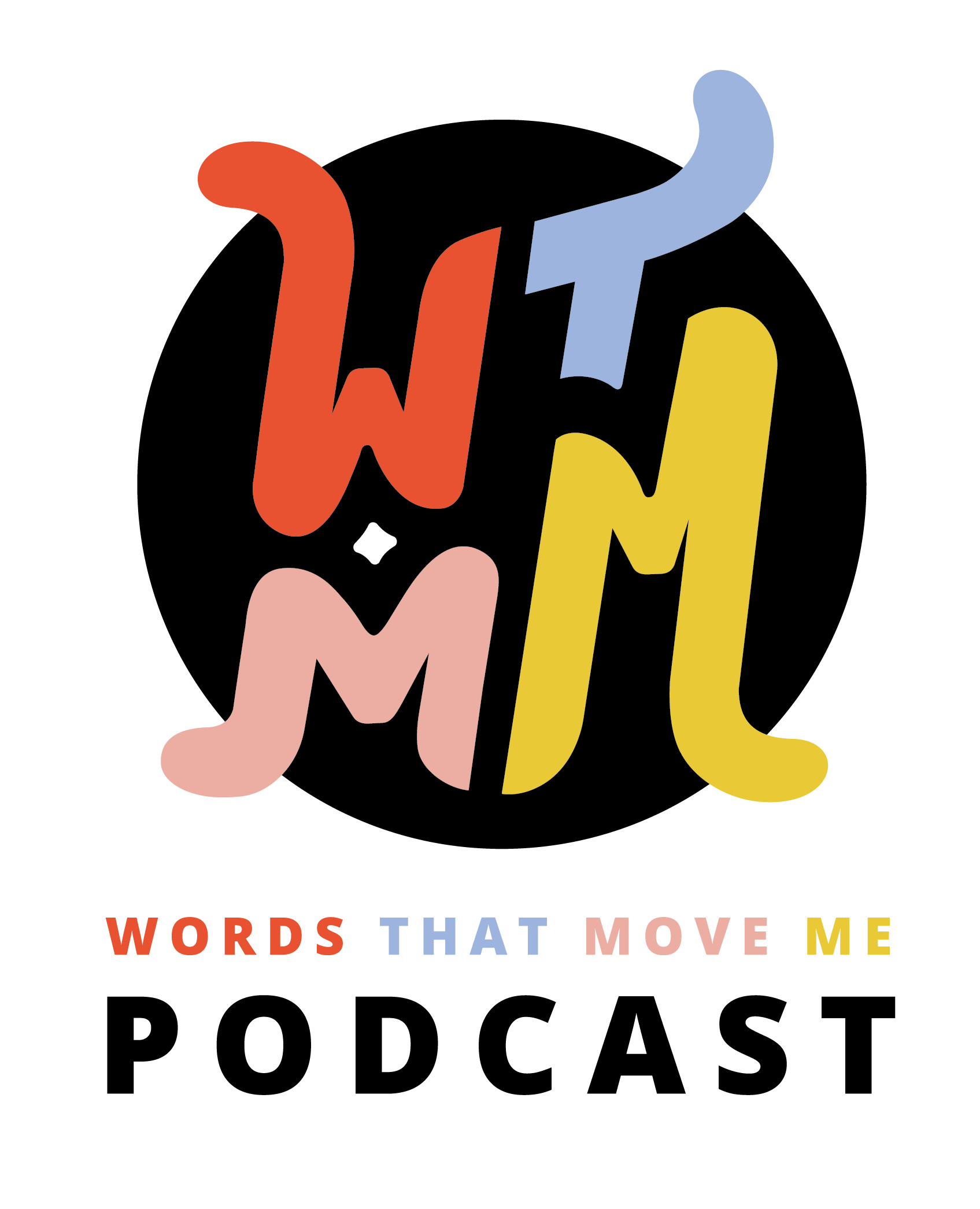
What the client wanted:
Understandably, this branding journey began with a traditional podcast cover. However as an illustrated, square image it quickly became apparent that the podcast cover wasn’t enough on its own to support the growing needs of the brand. The Words That Move Me Podcast needed a logo so that it could expand easily and effectively into other brand touch points such as t-shirts, hats, and totes without being held back.
How I delivered:
Because “Words That Move Me Podcast” is a mouthful, we wanted to begin laying the foundation to be able to have brand recognition for the acronym so that eventually it could potentially be used in place of the whole title. Because the acronym alone isn’t inherently meaningful, I endeavored to make the shape extraordinary and memorable instead. As such, the defining feature of this logo is the highly customized typography forming the brand acronym. It was important to integrate a feeling of movement into the design and this was achieved by extruding the letter shapes fluidly into their own respective “limbs”. The result is reminiscent of a Kieth Haring icon, wiggly and joyous. It generates the same kind of funky feelings you get listening to the podcast!


Cascade Health Care - Logo re-design made at Logical Position
What the client wanted:
Cascade Health Care wanted to modernize their logo and broaden their visual language to be more relevant for their entire target audience. While midwives and obstetricians remained an important part of their target audience, the brand had expanded to the enterprise medical industry and it was important to them to appeal to both sectors in a modern and compelling way.
How I delivered:
The concept I created, uses elements of the Red Cross symbol (originating in 1862, the Red Cross is internationally recognized as a trusted medical symbol) and check marks (signifying the breadth of product selection) to create an abstract butterfly (a symbol of embracing great change with grace and lightness). The visual intersection of the shapes and colors signifies the unity of advanced medical technology with the traditional knowledge of midwifery.
New logo:


Original Cascade Health Care Logo
Capital Iron Solutions - Logo re-design made at Logical Position
For Capital Iron Solutions, I increased legibility, streamlined the flow of information, incorporated meaningful colors, and provided file types that will enable them to utilize their new logo in all of their digital and printed marketing.
“Bree helped me with my logo and she was able not only to implement all my requests and ideas, but made them better. I’m extremely happy with the final product.”
Capitol Shakespeare - Logo re-design made for a client through my personal design practice.
Capitol Shakespeare’s logo re-design was especially sensitive as their original logo was created by someone who was a beloved member of their group that had passed away. For this reason, it was important to them to not only keep elements of their brand identity, but to celebrate and honor the foundations of the original design within their logo re-design. I was able to re-interpret the elements while staying true to their original concept, giving them a modern updated look and delivering flexible filetypes that would make it easy for them to implement their branding across a wide variety of collateral.


“I cannot say enough positive things about Bree’s work. Bree is extremely hard working and dedicated to her craft and you will be impressed with the caliber of work she creates.”